Today’s Master’s Monday has been one I’ve wanted to do for awhile now. It took me awhile to figure out how to mess around with settings to get something I liked, but I figured it out and I’m now sharing with you a way to get a more artistic photo.
Some Background
The premise for this tutorial came from a strange place in my brain. For a long while I had spent a lot of time thinking about something I had done in Jr. High. For some reason my French teacher had us all draw a famous painting by what I think were all French painters. We had a lot of choices, but the choice that stuck to me was Saint–Lazare Station by Manet.
I’m not sure why I was drawn to that particular painting, but it’s what I went to work on. It was the first (and only) time I’ve worked with oil pastels and I really loved the end result. Just wish I would’ve kept it.
So, I got to thinking – how would it be to use that kind of effect on some of photos? I went about scouring the internet for a tutorial, but just never found anything that I loved. So I did my own thing. It’s not the greatest, but it did what I wanted and hopefully with a bit of playing around, it’ll be the same for you.
Let’s Get Started
Start off with opening a photo of your choice. You then want to duplicate it twice. You do this by right clicking in your layers palette and a choice for duplicate comes up.
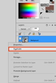
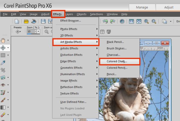
Step One
Duplicated Layers
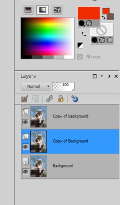
After you’ve duplicated your picture, make sure you select the topmost layer to work with. Then up in your toolbar select EFFECTS – ART MEDIA EFFECTS – COLORED CHALK.
Step Two
You will then see a popup like this:
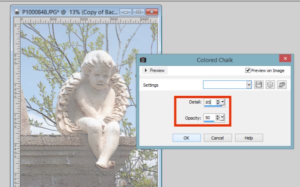
Colored Chalk Pop Up
I like to have PREVIEW ON IMAGE selected so that I can see just what type of effect I like. Mess around with the DETAIL and OPACITY numbers until you get something you like.
After you’ve OK’ed your chalk selection. Go to your layer palette and look for the chalked layers opacity. You want to bring it down some so that the color in your photo comes through. Again, this is something that will differ with your prefrences and your photo.
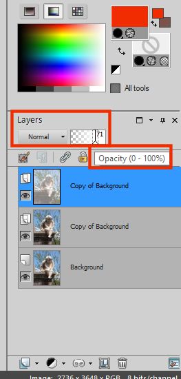
Opacity
We now want to make sure we are working with the middle layer, not the ‘chalked layer’ or the original photo.
In your toolbar go to ADJUST – HUE/SATURATION – VIBRANCY. We want to make this photo pop a little bit more.
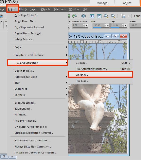
Step Three
Here we have another slider where we can adjust the strength of our vibrancy. I’ve kept PREVIEW ON IMAGE selected and moved my pop up window just slightly so that I can see just how bright it now makes my photo. This is another step that will just vary from person to person and photo to photo.
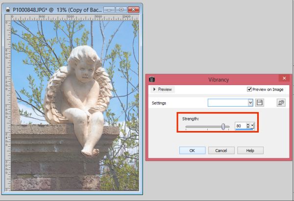
Vibrancy
We are now going to make it look more like it was painted. We do this by selecting EFFECTS – ART MEDIA EFFECTS – BRUSH STROKES.
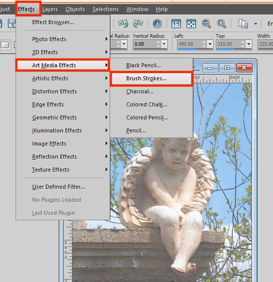
Step Four
Again, you will need to play around with settings until you get what you like. I found like I liked the SPECKLES option best and I kept it soft. You can change all these settings to get a completely different look. It all depends on what you are going for.
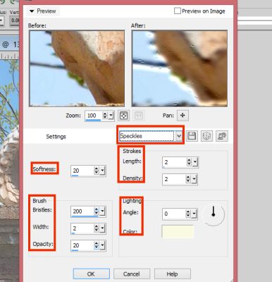
Brush Stroke Options
Our next step is to adjust the look and feel of our photo. We don’t want real distinct lines for this effect, so first we soften up the look of our subject. We do this by going to our toolbar and selecting ADJUST – SOFTNESS – SOFT FOCUS.
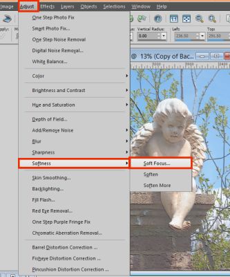
Step Five
Here’s a look at the options you can change with your soft focus. You will notice options about HALO. This gives your image a kind of glow in the center. If you want it, great – if not change the numbers to low numbers.
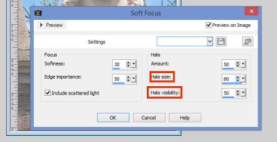
Soft Focus Option
From here we now want to soften the look of the whole thing. So we go to ADJUST – SOFTNESS – SOFTEN.
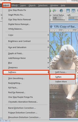
Step Six
You can do this step as many times as you feel necessary. You may need to view your image at 100% to best see the look you’re getting.
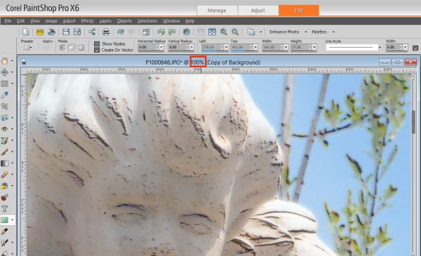
100% View
Now to give our photo a little more of an imperfect feel, we’re going to blur it just a bit. Go to your toolbar and select ADJUST – BLUR – BLUR MORE.
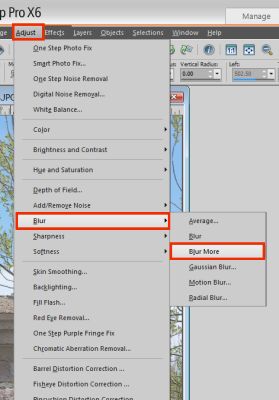
Step Seven
This is another step that may need to be done a few times.
When you feel you’ve got it where you want it, make sure the opacity level on the top layer is still where you want it. With everything you’ve done to the middle layer, you may need to lighten up the opacity some more.
When you are happy, go ahead and merge all layers together. (LAYERS – MERGE – MERGE ALL)
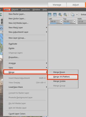
Merge
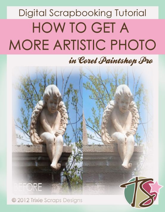
You now have a more artistic looking photo. At times it’ll be hard to see when it’s not zoomed in at 100%. But when you do zoom in to 100% you see the more artistic look to the photo. Keep in mind that different photos react differently to the steps above. What might work wonderfully for one photo – may not work as well for another. Just play around with your options until you’re happy.
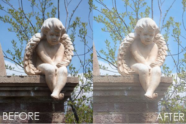
Side by Side
How I Used It
The above steps worked great for my purposes and the fact I was working with statues and not people helped as well. So I went ahead and made my layout.
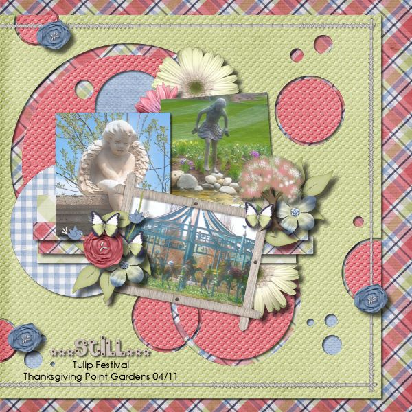
…Still… layout by Shilo
I made my layout using Spring In The Meadow and a template from Peek-A-Boo Vol. 2.
I’d love to see some more artistic looking photos in your layouts – so share them in the gallery. Remember, you can win a prize just for uploading to the gallery!